Tone of voice: Reviewing good examples and best practices
As a freelance UX Writer, one thing I’m often hired to do is help companies find the right tone of voice to communicate with their users throughout the product experience. More often than not, this leads to reworking the tone of voice higher up the funnel, beginning with the value proposition and marketing messaging to ensure consistency throughout the customer journey.
Part of finding the right tone of voice depends on research and asking questions like:
Who’s the target audience?
How would they describe this product in their own words?
What kind of language resonates with them?
How do they speak with their friends?
However, the other part is inevitably finding out what the company themselves envisage for their own tone. The easiest way for them to articulate this is by asking for examples.
So, here I’ve listed the five most frequently cited examples of aspirational tone of voice from my clients over the past year (bear in mind — I’m based in the UK). I’ve gone to each brand’s website and looked simply at the first screen, above the fold only. Here, I share my first impression of each, and hopefully learn a thing or two about tone in the process!
Innocent Drinks
Even though I work mainly with companies with entirely digital products or services, Innocent has come up more than a few times. And it makes sense. They’re famously quirky, human, and fun, the kind of drinks company that manages to make reading the ingredients in your smoothie an entertaining experience. I’m a fan already (just don’t tell them the only time I buy them is when they’re in the discount section because, well, expensive juice.)
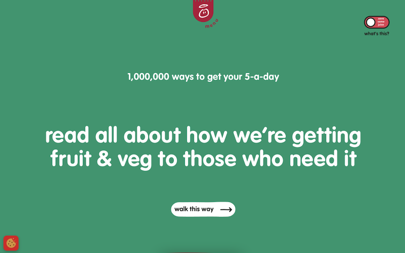
Source: Innocent Drinks
Firstly, Innocent doesn’t have to have a clear value proposition here. I doubt people visit their website and need to be persuaded to choose the path of Innocence — they’re probably already fans.
The title is related to one of their social good campaigns, which fits with their image. They are renowned for donating a proportion of their profits to charitable causes, after all. However, did you notice the lack of a full stop and the lack of capitalisation? For me at least, this makes the title feel more human, maybe even a little child-like, especially with the rounded font. That does indeed fit with being called “Innocent”.
The CTA is non-traditional, inviting you to “walk this way” rather than “learn more”, which functions directionally, guiding you to a new page, philosophically, to buy into the Innocent “do good” ethos, and musically because now I have this song in my head. This is a nice example of branded microcopy, beyond the normal boring “Learn more”, although they can afford to be vaguer here as there’s not necessarily a clear action associated with this button such as “Sign in”.
Above the title, we have a little playful hyperbole going on, stating a million ways to get to your 5 a day, which I believe from Innocent. If Tesco were to write this on their fruit and veg section, imagine how out of place that would look.
In the top-right corner, there’s a toggle labelled “save some juice”. I guessed this would be something about dimming the colours to save energy while loading the website, and I was right — this is delightfully playful copy and puts eco-friendliness at the forefront of their website, in fitting with their brand image. However, I could see how not everyone would instantly get the pun here, so the “what’s this” prompt is necessary and acts to draw attention to this adorable lil’ feature.
Headspace
In the past, I worked as a Product Manager for a fledgeling meditation app, and when I tell you Headspace was a literal obsession, I’m not exaggerating. They were ubiquitous and insanely popular at the time, and while still undoubtedly successful, it seems to me at least things are a little quieter on their end, so it was interesting to check back in when I was given them as a reference.

Source: Headspace
Ah, certainly not hiding the price anymore. Back in the day (2016, if that qualifies as a “back in the day”), products like Headspace would often hide pricing until a user was hooked after their first experience, so I was shocked to see this so prominently on the homepage.
Starting with the headline, it’s simple, it rhymes. It’s a little bit cliche, but it’s to the point — and, interestingly, it doesn’t mention meditation explicitly. From a tone perspective though, it’s pretty simple.
In the menu to select your plan, all the copy is pretty functional, with no thrills. Not that you’d want any thrills or particularly branded copy here, that would likely just irritate you and put you off paying (imagine if it said “7 days of freeing your mind on us” as opposed to simply “7 days free”).
There’s not much I can conclude from their tone here, to be honest, as it’s pretty functional, but perhaps that’s the point. Be upfront and direct about what you’re offering and the cost, and simple in how you express the benefit. Fluff-free.
Mailchimp
Mailchimp is mentioned almost every time I ask people for an example of an aspirational tone of voice. I don’t think it’d be too much of a stretch to say they’re like the Innocent Smoothies of the email marketing world, but then again, I’m not sure that’s such an achievement.

Source: Mailchimp
The value proposition made me smile ever so slightly. There’s something delightfully cheeky about a B2B tool making a bit of a cheesy pun in their headline, and I think Mailchimp pull it off well here with their bright, vibrant branding.
The subtitle elaborated this in a simple, matter-of-fact manner, using imperative language “Engage your customers” and “Boost your business” while using a couple of adjectives to describe their platform without going over the top.
The CTAs are functional, as they need to be to make the associated actions clear.
This is a great example of injecting a bit of cheeky personality in the appropriate places. By using a pun in the headline, you get a sense of Mailchimp’s brand, but by keeping the other copy direct and more functional, you also get the information you need without any vagueness. Nice.
Trello
As a millennial, I have to say that if I see any website with pastel colours, I’m probably going to sign up, no questions asked. Joking, of course, but I’m sure some brand teams out there think that’s true.

Source: Trello
Firstly, I like the fact their main value proposition has movement-based language in it. Project management is a big old corporate topic and can feel stale and still, so including a hint of direction by literally talking about “moving forward” feels energising and refreshing.
The description then elaborates on the core actions possible with Trello, but my first impression is that it starts to sound a little too salesy with the “From x to y” construction to talk about use cases. It’s the same as saying “Whether you’re a freelancer in London or a stay-at-home dad in Tampa” kind of thing. This construction feels stale, like something someone would say to me in a sales pitch.
This contradicts the tone they seem to be going for, which is fun. Check out that exclamation mark in the sign-up CTA, how daring. This tone just feels a little uneven when inserted into salesy-sounding constructions with just a little too much alliteration to feel sincere. A more human or natural-sounding sentence might be more successful, in my opinion.
This is one of those cases where I would ask Trello users to describe in their own words what they do with Trello and use this to build a corpus of language that feels more natural for potential users. Not that you need to write word-for-word here what a user answers with, but to inspire a more human tone rather than sounding salesy.
Starbucks
Imagine my face when an accountancy firm named Starbucks as inspiration for their tone of voice…

Source: Starbucks
Let’s state the obvious: a lot is going on here. The architecture of the information presented is all over the place, and the CTAs give me minor anxiety.
We’re here to talk tone, and to be honest? It’s a little mixed. In places, it seems to err more on the colloquial and friendly side, with liberal use of exclamation marks, emojis and expressions like “your usual”. The “Yessss” with lots of Sssss’s also reeks of trying to appeal to a younger audience (they need to change the “e” to and “a”, or we can tell this was written by someone older).
I’m not sure it’s successful, but I appreciate the attempt to sound youthful here. Starbucks is a corporate behemoth, so I imagine for a lot of younger adults, their main competition is probably cooler independent coffee shops, so they’ve tried to adapt their tone to be more relatable.
If you’re interested in some other viewpoints on good practice surrounding brand voice with some excellent examples, check out these articles too (and yes, there may be some familiar brands!):
The best tone of voice examples we’ve found from The Way with Words blog which has some excellent examples of tone of voice guidelines.
7 Best Examples of Brand Voice and Tone from ebaqdesign lists some more examples for you to check out too (with an alternative view of Starbucks).
So that’s just a few impressions of the tone of voice for brands my clients often aspire to emulate...
=====
Now that you’ve read this, you might be interested in